Problem
I have a chart in SQL Server Reporting Services (SSRS), based upon data from a SQL Server table. I want to add alinear trendline to this chart, just like in Excel. How can I achieve this functionality?
Solution
In the tip Adding a calculated series to a graph in Reporting Services we learned how we can add calculated series to a chart in SSRS. However – for some unknown reason – Microsoft never included a simple linear trendline as an option while in Excel it’s just a click on a button. This means we have to calculate it ourselves of course.
In the Wikipedia article Simple linear regression, we can find more information on how to calculate linear regression.
When you have n data points {(xi,yi), i= 1..n}, then the function for the linear regression is the following:

Here n is the sampling interval, α the intercept, β the slope and εi an error variable.
We can find β with the following formula:

Once we find β, we can calculate α like this:

A character with a horizontal bar on top is shorthand for the average. These formulas might seem impressive, but they are actually quite easy to implement in T-SQL. But first we need to set-up some sample data.
Set-up test for a Linear Trendline for SSRS
In our example we have sales data for a not specified product over the different months. We are going to create a trendline on this data. The following statement creates the data and stores it into a temp table.
-- clean-up
IF OBJECT_ID('Tempdb..#Temp_Regression') IS NOT NULL
 DROP TABLE #Temp_Regression;

-- create sample data. Trend is an empty column that will hold the calculated linear regression later on.
SELECT ID = 1, OrderMonth = 'Jan 2014', OrderQuantity = 45, Trend = CONVERT(DECIMAL(38, 10),NULL)
INTO #Temp_Regression
UNION ALL
SELECT ID = 2, OrderMonth = 'Feb 2014', OrderQuantity = 41, Trend = CONVERT(DECIMAL(38, 10),NULL)
UNION ALL
SELECT ID = 3, OrderMonth = 'Mar 2014', OrderQuantity = 60, Trend = CONVERT(DECIMAL(38, 10),NULL)
UNION ALL
SELECT ID = 4, OrderMonth = 'Apr 2014', OrderQuantity = 50, Trend = CONVERT(DECIMAL(38, 10),NULL)
UNION ALL
SELECT ID = 5, OrderMonth = 'May 2014', OrderQuantity = 53, Trend = CONVERT(DECIMAL(38, 10),NULL)
UNION ALL
SELECT ID = 6, OrderMonth = 'Jun 2014', OrderQuantity = 58, Trend = CONVERT(DECIMAL(38, 10),NULL)
UNION ALL
SELECT ID = 7, OrderMonth = 'Jul 2014', OrderQuantity = 65, Trend = CONVERT(DECIMAL(38, 10),NULL)
UNION ALL
SELECT ID = 8, OrderMonth = 'Aug 2014', OrderQuantity = 70, Trend = CONVERT(DECIMAL(38, 10),NULL)
UNION ALL
SELECT ID = 9, OrderMonth = 'Sep 2014', OrderQuantity = 63, Trend = CONVERT(DECIMAL(38, 10),NULL);
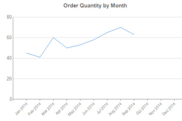
In this example, ID is the x-coordinate and OrderQuantity the y-coordinate. The data looks like this on a graph:
Calculating the trendline
First we are going to create a whole bunch of variables that will store the different parts of the formulas. Using standard T-SQL aggregations functions, they are straight forward to calculate.
-- declare all variables
DECLARE @sample_size INT;
DECLARE @intercept  DECIMAL(38, 10);
DECLARE @slope   DECIMAL(38, 10);
DECLARE @sumX   DECIMAL(38, 10);
DECLARE @sumY   DECIMAL(38, 10);
DECLARE @sumXX   DECIMAL(38, 10);
DECLARE @sumYY   DECIMAL(38, 10);
DECLARE @sumXY   DECIMAL(38, 10);

-- calculate sample size and the different sums
SELECT
  @sample_size = COUNT(*)
 ,@sumX   = SUM(ID)
 ,@sumY   = SUM([OrderQuantity])
 ,@sumXX   = SUM(ID*ID)
 ,@sumYY   = SUM([OrderQuantity]*[OrderQuantity])
 ,@sumXY   = SUM(ID*[OrderQuantity])
FROM #Temp_Regression;

-- output results
SELECT
  SampleSize   = @sample_size
 ,SumRID    = @sumX
 ,SumOrderQty   =@sumY
 ,SumXX    = @sumXX
 ,SumYY    = @sumYY
 ,SumXY    = @sumXY;
Now we just have to put the different parts together to calculate the slope and the intercept.
-- calculate the slope and intercept
SET @slope = CASE WHEN @sample_size = 1
    THEN 0 -- avoid divide by zero error
    ELSE (@sample_size * @sumXY - @sumX * @sumY) / (@sample_size * @sumXX - POWER(@sumX,2))
    END;
SET @intercept = (@sumY - (@slope*@sumX)) / @sample_size;
Now that we have found the slope and the intercept, we can easily calculate the linear trendline in each x-coordinate. We store the results in the temp table.
-- calculate trend line
UPDATE #Temp_Regression
SET Trend = (@slope*ID) + @intercept;

-- output results
SELECT * FROM #Temp_Regression;
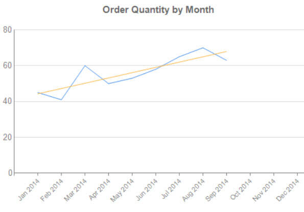
We get the following result in SSRS when we add another line to the chart using the trend data.
Let’s tweak the layout a bit so the trendline stands out.
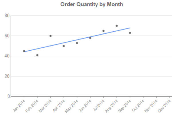
The dots were achieved by changing the chart type of OrderQuantity to Line with Markers and then setting the border width to 0.25pt, which apparently makes the lines disappears.
Creating a forecast
Using the linear trendline, we can do some rudimentary forecasting. We just supply new months into the regression function and we get a prediction of the order quantity.
This is done with the following code:
/* calculate predicted values */

-- create a full list of 12 months
WITH CTE_AllIDs AS
(
 SELECT TOP 12 ID = ROW_NUMBER() OVER (ORDER BY (SELECT NULL))
 FROM sys.columns
)
SELECT
  c.ID
 ,OrderMonth  = CASE WHEN r.ID IS NOT NULL
       THEN r.OrderMonth
       -- elaborate function to get the short month name and year
       ELSE CONCAT(LEFT(DATENAME(MONTH,CONVERT(DATE,CONCAT('2014','-',c.ID,'-','01'))),3),' 2014')
       END
 ,OrderQuantity
 ,Trend
 ,Forecast  = CASE WHEN Trend IS NOT NULL AND c.ID <> (SELECT MAX(ID) FROM #Temp_Regression)
        THEN NULL
       -- For the last actual value (September in this example), we want forecast to have the same
       -- value as the trendline (instead of NULL). This prevents a gap in the line charts in SSRS.
       WHEN Trend IS NOT NULL AND c.ID = (SELECT MAX(ID) FROM #Temp_Regression)
        THEN Trend
       -- If trend is not found, it means we can calculate a forecast.
       -- However, we also need to check if the month for which we calculate the forecast comes after
       -- the actual values. Suppose we don't have values for January, then we don't want to calculate
       -- a forecast for January as well. Only for the last 3 months of the year in this example.
       WHEN Trend IS NULL AND c.ID > (SELECT MAX(ID) FROM #Temp_Regression)
        THEN (@slope * (c.ID % 100)) + @intercept
       ELSE NULL
       END
FROM  CTE_AllIDs   c
LEFT JOIN #Temp_Regression r ON c.ID = r.ID;
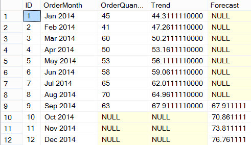
First we create a list of all the months we want on the graph, including months not provided by the original data set. If the trend is already known for a month, we keep the forecast empty. If the trend is not known, we calculate the forecast using the slope and the intercept. For the last month of the original data set (September in our example), we calculate the forecast as well. This prevents SSRS from having a gap between the trendline and the forecast line.
This gives the following result set:
Let’s plot this in SSRS, where the forecast is indicated by a dotted line:
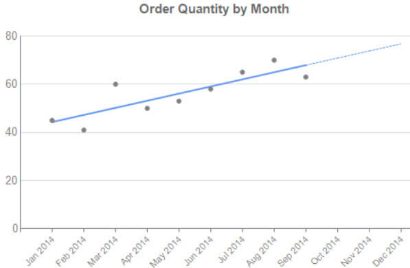
Keep in mind that this is a very simplified forecast which might have a high error margin. It also doesn't keep effects such as seasonality in account. There are more efficient trendline algorithms available for better forecasts.
Conclusion
Although there is no built-in option in SSRS to display a linear trendline on a chart, it is straight forward to do the calculation in T-SQL. This assumes a relational source of course.
No comments:
Post a Comment